Most photographers build a portfolio by choosing the ten strongest frames and stacking them in descending order of quality. That is a competition hang, not a sequence. An editor at a literary magazine reads your submission from top to bottom in one sitting, usually on a laptop, often between two other jobs. What stays with them is not a single image so much as the shape the whole set made as it moved.
Sequencing is editorial work, closer to arranging poems in a pamphlet than to picking a profile picture. It rewards patience, and it is the part of a submission photographers most often skip.
Sequence Is a Sentence, Not a Pile
Before you move anything, decide what your first image promises and what your last image delivers. Those two frames carry more weight than the rest combined. A wide, cold, empty street tells the reader to expect distance and quiet; a close, warm, half-lit face tells them to expect intimacy. The closing image should feel like the end of a thought, not an exhausted shrug.
Between them, something has to change. A set that opens and closes with the same kind of image, in the same light, at the same distance, reads as a series of alternatives rather than a piece of work. Ask what the reader knows by image six that they did not know by image two — about a place, a person, a way of looking. If the answer is nothing, you have a list.
Building Rhythm, Frame by Frame
Poets work with line breaks. Photographers work with the same principle at a larger scale: the pause between images is part of the reading. Eight frames that are all densely textured, all mid-toned and all busy will exhaust the eye by the fourth. Eight that are all expansive and soft will blur into one another until nothing stands out.
Vary at least one thing between neighbours. The useful levers:
- Tonal weight — a dark, heavy frame settling beside a pale, airy one.
- Distance — a wide establishing view, then something close enough to feel uncomfortable.
- Human presence — faces, then the aftermath of people, then nothing at all.
- Motion — blur beside stillness, a held moment beside something slipping away.
- Colour temperature — a grey frame can make a warm one sing, and the reverse.
- Density — a frame you read in a second, then one that takes twenty.
A rough pattern for a set of eight: strong opener, counterpoint, build, quiet frame, build again, unexpected detour, near-climax, close. Not a formula — just a reminder that the middle is where readers drift, and where a well-placed hush does the most good.
Pairing: The Facing-Page Problem
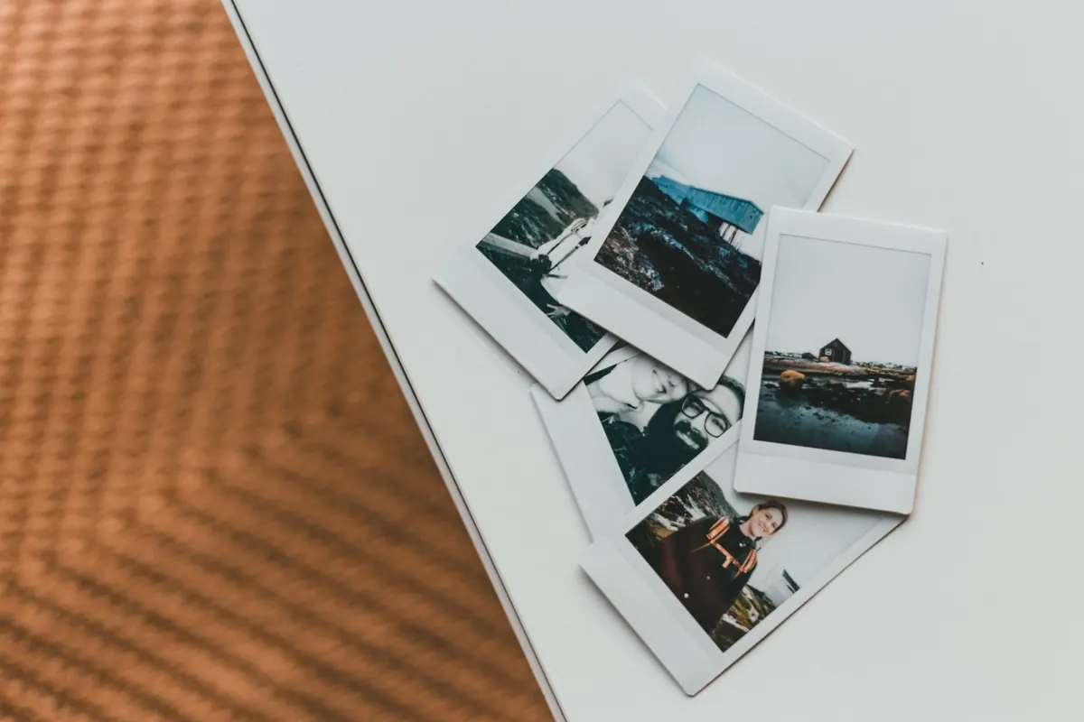
If your work might appear in print, remember that images land in pairs. A spread is read left to right, like a sentence, and the two halves talk to each other whether you intended it or not. Two frames of the same subject can feel like a stutter or a refrain, depending on how different the light is. A vertical beside a horizontal creates a ragged top edge that some designers love and others quietly crop around.
A simple test: lay everything in a grid and cover all but two neighbours. Ask what that pair says. If the answer is "the same thing twice", move one. If it is a small argument or a small joke, keep it.
Adjacency checks worth doing
Watch for accidental repetitions across the whole set, not just next door: three frames with a strong diagonal, two images with the same horizon height, four photographs made in the same hour of the same afternoon. Editors notice sameness faster than they notice brilliance, because sameness is easier to describe when they pass.
Captions Do Quiet Work
Read the magazine's guidelines before deciding anything about text. Some literary titles want titles only; some want place and year; some want a single line of context; a few want nothing and will set your images clean. Follow what they ask, even if you would prefer otherwise. A submission that ignores the caption format signals that the rest of the brief may not have been read either.
Where captions are welcome, keep them factual and unadorned — place, year, who or what, if it is not obvious. Resist explaining the emotion of the picture; the reader is there to feel it. If a caption is doing the work the photograph should be doing, the photograph may not need to be in the set. Number your files in sequence — 01, 02, 03 — so a preview pane or a hasty download preserves your order instead of rearranging it alphabetically.
Print and Screen Are Different Rooms
On a screen, a portfolio is a drumbeat: one image at a time, full width, with a scroll between each. You hold attention for a second or two, and you cannot rely on two images being seen together. Check that your opener survives as an inbox thumbnail and as a full-screen image a moment later.
In print, the unit of reading is the spread. Sequence in pairs, think about the gutter, and remember that ink sits differently from light: deep shadows can block up and pale skies can lose their delicacy on uncoated paper. Mid-tone images full of fine detail sometimes lose separation at magazine scale, so avoid placing two side by side. Mixed aspect ratios are fine — but decide whether the layout should breathe or run tight to the edge, and say so briefly in your cover note without insisting on it.
Read It Aloud, Then Cut
Give the sequence one honest pass before you send it. Lay prints on the floor, or open the folder in a contact-sheet view, and walk away for an hour. When you come back, remove the frame you find yourself defending. Set aside the image you love because of the day you took it, not because of what it does for the set. Nine good frames in the right order beat twelve in which three are there to be safe.
Then read the whole thing through once without stopping, the way an editor will. If you skip a frame to get to the next one, so will they.
Before You Send It
- Re-read the guidelines and match your file format, image count and caption style to what is asked.
- Name files in sequence, and send the number of images requested — no extras.
- Check that your opening and closing frames do different jobs.
- Print two or three images at roughly the size they will appear, if you can, and look at them side by side.
- Write a short, plain cover note: what the set is, where it was made, anything an editor needs to know.
- Export a second version in a different order and compare. The quieter arrangement is often the better one.
Send the version you would still stand behind in six months, then let it go. Editors reply slowly, and a sequence built with care tends to survive the wait better than one assembled in an evening.
Photo: Erik Mclean / Pexels